
3 Mins Read
3 Mins Read
3 Mins Read
How We Achieved Product-Market Fit with ModeMagic
How We Achieved Product-Market Fit with ModeMagic
Client
Client
Mason
Mason
Timeline
Timeline
Nov 2020 – Mar 2021
Nov 2020 – Mar 2021
Role
Role
UX Designer & User Researcher
UX Designer & User Researcher
Outcome
Outcome
Significant increase in user retention and became the biggest revenue generator for the company. We were awarded Product Hunt Golden Kitty Award for 2021 and the Shopify Ecommerce 2020 Award for the Best User Interface.
Significant increase in user retention and became the biggest revenue generator for the company.
Significant increase in user retention and became the biggest revenue generator for the company.
Awards
Awards
Product Hunt Golden Kitty Award for 2021 and the Shopify Ecommerce 2020 Award for the Best User Interface.
Product Hunt Golden Kitty Award for 2021 and the Shopify Ecommerce 2020 Award for the Best User Interface.
Introduction
Introduction
ModeMagic is a Shopify app that allows e-commerce merchants to add promotional badges and automation to their product listings, helping them stand out and drive conversions. When I joined the team, the app had great potential but was struggling with high uninstall rates and low repeat usage. As the lead designer on the project, my goal was to reimagine the user experience to improve retention, make key features more discoverable, and build a foundation for scalable automation. This case study walks through how we identified friction points, simplified the interface, and ultimately turned ModeMagic into one of Mason’s top-performing products.
The Problem
The Problem
40% of new users were uninstalling the app shortly after installation
40% of new users were uninstalling the app shortly after installation


PAIN & OPPORTUNITIES
Customer Voice
Customer Voice

Navigating through the stickers is such a pain!

The effort I put into browsing stickers is a bit straining

I'm feeling a bit anxious not knowing how much it'll cost me when I select products.

Honestly, trying to picture how my site will look is a headache

I'm kind of in the dark about how much it's going to cost me when I select products.

I would love it if would automatically apply new sticker as I add new products.

It is hard for me to browse through the sticker.

I've been thinking, it would be fantastic if the system could take care of applying new stickers whenever I add new products.

I've been thinking, it would be fantastic if the system could take care of applying new stickers whenever I add new products.

It is hard for me to browse through the sticker.

I would love it if would automatically apply new sticker as I add new products.

I'm kind of in the dark about how much it's going to cost me when I select products.

Honestly, trying to picture how my site will look is a headache

I'm feeling a bit anxious not knowing how much it'll cost me when I select products.

The effort I put into browsing stickers is a bit straining

Navigating through the stickers is such a pain!


Applying Double Diamond
Applying Double Diamond
The Double Diamond helps teams identify the right problem and develop the right solution. It consists of four stages across two diamonds.
The Double Diamond helps teams identify the right problem and develop the right solution. It consists of four stages across two diamonds.


Discover: Understanding the Problem (Divergent)
Discover: Understanding the Problem (Divergent)
At this stage, we cast a wide net to understand user pain points, behaviors, and business goals.
User Research & Insights:
Conducted user interviews with merchants to understand their workflow and frustrations.
Analyzed Hotjar session recordings to see where users were dropping off.
Mapped user journeys & created empathy maps to visualize their struggles.
Key Finding:
👉 Users preferred selecting stickers before choosing a product, but our current workflow forced them to do the opposite, leading to frustration
We began by observing user behavior and gathering insights:
User Research & Insights:
Conducted user interviews with merchants to understand their workflow and frustrations.
Analyzed session recordings to see where users were dropping off.
Mapped user journeys to visualize their struggles and identify opportunities.
💡 Key Finding:
Users preferred selecting stickers before choosing a product, but our current workflow forced them to do the opposite, leading to frustration.
Define: Pinpointing the Core UX Issues (Convergent)
Define: Pinpointing the Core UX Issues (Convergent)
After gathering data, we narrowed down the problem statement using the Jobs-to-be-Done (JTBD) framework:
"When I run a sale, I want to quickly highlight my promotions so I can increase conversions without spending too much time designing."
Core Problems Identified:
Users wanted to pick a sticker first, then a product, but our flow forced the opposite.
No easy way to find stickers with similar messaging (e.g., all "Sale" variations).
Users had no clear view of their credit balance, leading to confusion at checkout.
Develop: Ideation & Prototyping Solutions (Divergent)
Develop: Ideation & Prototyping Solutions (Divergent)
With clear problems defined, we rapidly tested and iterated solutions using Lean UX principles:
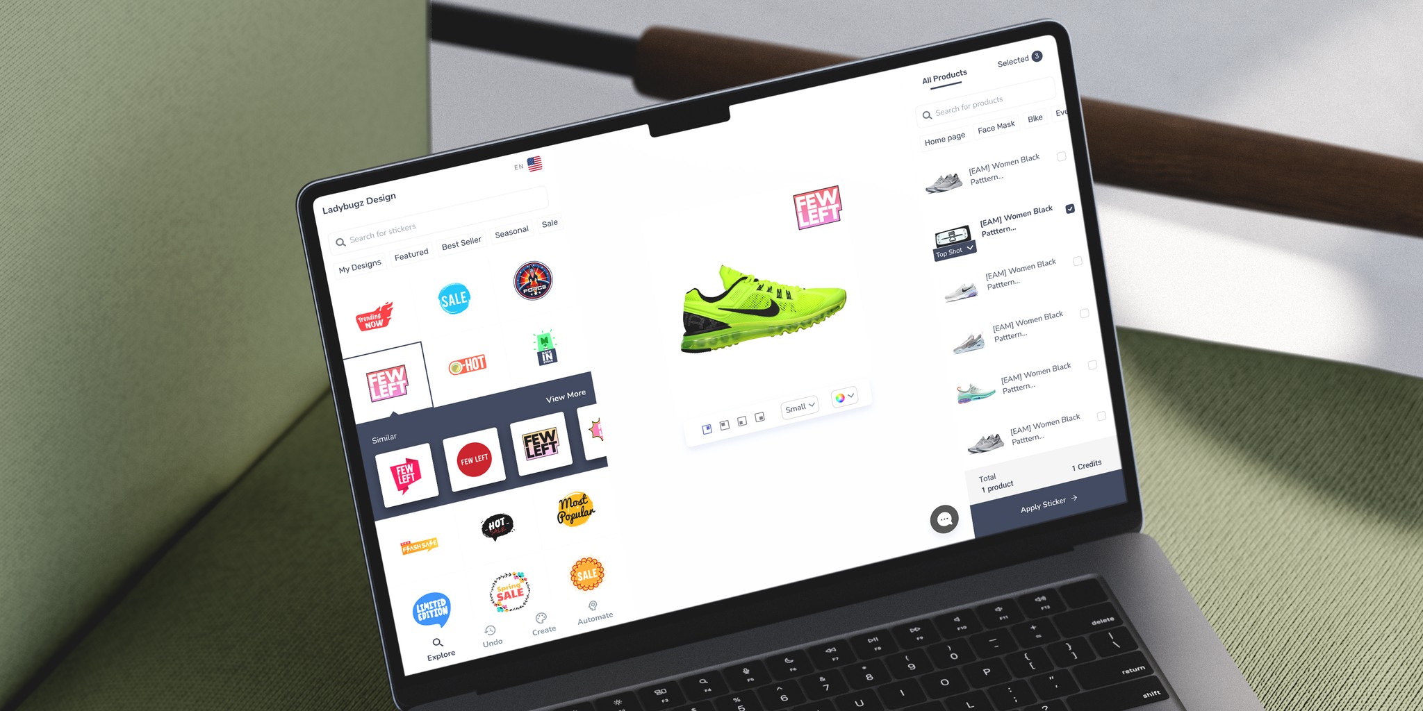
Reversed the Workflow: Sticker selection now came before product selection, matching user expectations.
Introduced Intent-Based Recommendations: When users picked a "Sale" sticker, they were shown similar stickers, reducing search time.
Improved Cart Visibility: Made the cart persistently visible so users always saw their credits and costs.
Deliver: Implementation & Measurable Impact (Convergent)
Deliver: Implementation & Measurable Impact (Convergent)
The redesigned ModeMagic experience led to:
🎯 Increased retention: More users stayed after onboarding.
💰 Revenue Growth: Became the company’s top-performing product.
🏆 Awards & Recognition: Won awards and recognition from industry
The redesigned ModeMagic experience led to:
🎯 Increased retention: More users stayed after onboarding.
💰 Revenue Growth: Became the
company’s top-performing product.
🏆 Awards & Recognition: Won awards and recognition from industry
Before & After
Before & After


Turning Feedback into Features
Turning Feedback into Features
Adapting our product based on real user needs for a smoother, more intuitive journey.
Adapting our product based on real user needs for a smoother, more intuitive journey.
Impact
Impact
ModeMagic redesign delivered substantial value, boosting retention rates, user engagement, and satisfaction. It also earned prestigious awards, affirming our dedication to enhancing user experience and our product's potential as a valuable tool for Shopify users. Recognizing the app's potential as a robust tool for Shopify users, our company decided to channel further investments into it.
Redesigning ModeMagic was a deeply rewarding experience, not just because of the measurable impact we saw, but because it reaffirmed the value of thoughtful, user-centered design. It reminded us that even small UI tweaks, when grounded in real user insights, can lead to disproportionate value and significantly improve the overall product experience.
👌 Installed the app to highlight top products. Everything works very easily, support is super fast and responds in minutes. I totally recommend this app, helps utilize badges easily
eCommerce Manager
Parfümerie Brückner GmbH
This app is very useful. I love it. Easy to install, my least selling products get attention once I apply the badge. Easy to install & use. Recommended!
Founder
DD’S Bridal
I can't say enough good things about it without sounding like I'm being paid for this review. You might think you "don't need no stinkin' badges" - but you do! ModeMagic is magic :)
Staci
Grateful Merchant Co.
Frankly, amazing app. A free plan for testing, and the starter pack accommodates badges on 200 products! Support is amazin', they have cool badges and you can even create your own
Khaled
TheNumber1Official
Really great customer service. I used the chat service and the rep was very helpful! I need lots of help as I am technically challenged and I can get the help I need with ModeMagic
Darla
Boone's Solace Candles Co
This app is very fast and helpful. Makes it easy for shoppers to know what products would be new, best sellers, etc. Definitely would recommend for a boost in store sales
Founder & Director
SpadezStore
We love the badges & how easy it’s to add them to multiple listings. The auto update feature is amazing! Not having to constantly monitor and update the store is a real-time saver
eCommerce Manager
Infidel Jeep
I’d see Blenders Eyewear with "Hot" "Coming Soon" on their sunglasses, and I've wanted something similar for our watercolor journals. ModeMagic is quick, easy, and customizable
Marketing Head
Wild Plein


